Review of fluxus language/taoist geometry by Todd Camplin from moderndallas.net
fluxus language/taoist geometry
Cecil Touchon/David Carlsonat Cohn Drennan Contemporary through November 12
by Todd Camplin
Cohn Drennan Contemporary has a great eye for pairing artists and this month is no exception.
The gallery has paired theorist and artist Cecil Touchon with artist David Carlson. With a title like
“Fluxus Language/Taoist Geometry,” I feel I can nerd it up a bit with my thoughts on philosophy
and art history, so please excuses my indulgence. Visually this show complements and contrasts
like the push and pull of Hegelian dialectic, but with no clear synthesis.

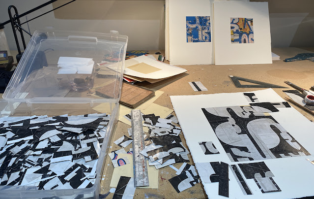
The majority of Cecil Touchon’s works in the show consist of breaking apart text and letters
into shapes and lines. Touchon is deconstructing text in ways I would image the philosopher
Jacques Derrida might have if he were a painter. You get a sense that each part of the
painting is made of words, but Touchon leaves his art unreadable. Since the invention
of printing press, the Latin based alphabet seems to have run into an aesthetics decline,
unless you are font-head like me. However, Touchon and artists like him have been
breaking up words to allow us to see the beauty of the text. From the cross of the ‘t’
to the curve of the ‘o’, these paintings let us pause upon the letter forms, without
distracting us through reading a message.

Touchon’s application of paint reminds me of the 20th century abstract painting of Stuart
Davis, and the composition uses elements of collage that reflect an almost cubist senility.
I can easily imagine Touchon giving us multiple perspectives of words, in the same way Picasso
approached the portrait. His black and white paintings of lines overlapping in
a kind of gesture of layered writing caught my eye, because these few paintings were
very different from the rest of the show. They seem to be taking the investigation of line
and gesture in a very different direction.

David Carlson’s paintings also brake up shapes, but the colors are vivid as a Vorticism.
Carlson’s painting ranges from flat texture to an almost relief sculpture of painted
thickness. White lines of paint seem to draw rounded patterns that are repeated
in the thick colorful relief paint. Carlson’s lines flow and stop abruptly, much in the
same way as Touchon’s work. Carlson also strips out the conceptual and symbolic
ideas for a more material message. These art works are about paint and painting.
The geometric shapes only help to emphasize the different uses and qualities of paint.

Cecil Touchon has a very intellectual, conceptual approach, where as David Carlson
seems to have a more stripped down, clear headed Zen process. But somehow, this
contrast seems to yield a few similarities that make the two artists complementary to
one another. I hope you get to see this show. And don’t forget to peek in their new
extra storage space. “Fluxus Language/Taoist Geometry,” runs through November 12th.
Cecil Touchon/David Carlsonat Cohn Drennan Contemporary through November 12
by Todd Camplin
Cohn Drennan Contemporary has a great eye for pairing artists and this month is no exception.
The gallery has paired theorist and artist Cecil Touchon with artist David Carlson. With a title like
“Fluxus Language/Taoist Geometry,” I feel I can nerd it up a bit with my thoughts on philosophy
and art history, so please excuses my indulgence. Visually this show complements and contrasts
like the push and pull of Hegelian dialectic, but with no clear synthesis.

Cecil Touchon, PDP452, a.c, 36 x 36 in
The majority of Cecil Touchon’s works in the show consist of breaking apart text and letters
into shapes and lines. Touchon is deconstructing text in ways I would image the philosopher
Jacques Derrida might have if he were a painter. You get a sense that each part of the
painting is made of words, but Touchon leaves his art unreadable. Since the invention
of printing press, the Latin based alphabet seems to have run into an aesthetics decline,
unless you are font-head like me. However, Touchon and artists like him have been
breaking up words to allow us to see the beauty of the text. From the cross of the ‘t’
to the curve of the ‘o’, these paintings let us pause upon the letter forms, without
distracting us through reading a message.

Cecil Touchon, PDP289, ac, 54 x 36
Davis, and the composition uses elements of collage that reflect an almost cubist senility.
I can easily imagine Touchon giving us multiple perspectives of words, in the same way Picasso
approached the portrait. His black and white paintings of lines overlapping in
a kind of gesture of layered writing caught my eye, because these few paintings were
very different from the rest of the show. They seem to be taking the investigation of line
and gesture in a very different direction.

David Carlson - Behind the Sun
Carlson’s painting ranges from flat texture to an almost relief sculpture of painted
thickness. White lines of paint seem to draw rounded patterns that are repeated
in the thick colorful relief paint. Carlson’s lines flow and stop abruptly, much in the
same way as Touchon’s work. Carlson also strips out the conceptual and symbolic
ideas for a more material message. These art works are about paint and painting.
The geometric shapes only help to emphasize the different uses and qualities of paint.

David Carlson - Flying Baby Twister
seems to have a more stripped down, clear headed Zen process. But somehow, this
contrast seems to yield a few similarities that make the two artists complementary to
one another. I hope you get to see this show. And don’t forget to peek in their new
extra storage space. “Fluxus Language/Taoist Geometry,” runs through November 12th.

Comments
Violette